Insight into the capacity of your resources is very important for your planning. This is clearly shown in the timeline.
For each phase and resource, just as in the calendar view, your capacity per day or week, and what is planned, is shown.
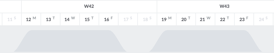
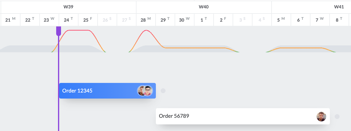
The capacity per resource and phase (depending on how you view the timeline) is displayed with a light grey area divided over the active days in your calendar:
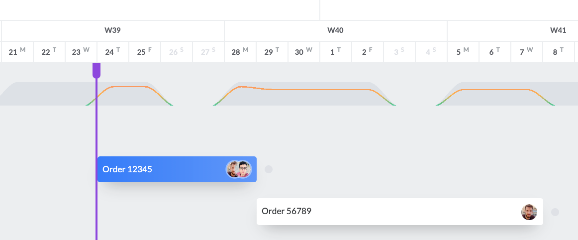
As soon as you make planning in the timeline, a graph line will be shown in this capacity area indicating how much of the capacity is planned. When the line stays within the grey area, there is no problem and you have enough capacity. However, as soon as the graph line rises above the capacity area you know that your capacity has been over-planned.
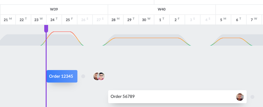
You can solve this by adjusting your planning, for example by extending the end date of the card until the line drops below the critical capacity limit again.
Hint: As soon as you plan the capacity of a phase or resource with a large number of hours, the scale of the capacity plane is adjusted to reflect the large difference in planned hours and capacity as in the example below:
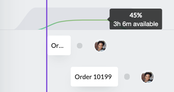
Hint: When you move your mouse over the capacity graph, you can see the actual planned percentage of your capacity and the remaining hours. You get insight into capacity per day by moving your mouse from day to day.